Showing posts with label how to. Show all posts

Sunday, June 2, 2013

Fade In/Out Page Loading Effect On Blogger Posts

A very common effect in jQuery is the fade effect that hides or shows an element by fading it, and we can use it in many ways as for example in the blog's navigation. The following script does just that, by loading the page with a fading effect when we browse on internal links that are in the blog, such as post titles, labels links, archive, navigation links, etc..
jQuery effect, fade in effect, blogger jQuery
You can see an example in this demo blog, click on the title of any post and see the fading effect when the page is loading.

How To Implement the Fade In Loading Effect

1) To put this fading effect on your blog, go to your Template > Edit HTML :

fading effect, blogger blogspot, blogger tricks

2) Click anywhere inside the code area and search for the </head> tag using CTRL + F keys:


3) Then, just above </head> add the following code:
<script src='http://ajax.googleapis.com/ajax/libs/jquery/1.8.2/jquery.min.js' type='text/javascript'/>
<script type='text/javascript'>
//<![CDATA[
$(document).ready(function() {
$("body").css("z-index", "-10");
$("body").fadeIn(0);

$("a").click(function(event){
event.preventDefault();
linkLocation = this.href;
$("body").fadeOut(500, redirectPage); });
function redirectPage() {
window.location = linkLocation;
}
});
//]]>
</script>
<style>
html {
background-color: #F2F2F2; /* Color fading */
}
</style>
4) Save the changes and that's it. In green you can see where to change the color that fades on a loading page.

The original script hides the body of the page while loading, I prefer to change that property with a negative z-index to avoid problems with the search engine robots that may effect the positioning.

Problems?

Consider that such effects could increase the blog loading time, so I recommend using it only when your blog loads fast and does not have too many scripts.

If you already use another version of jQuery remove the other, leaving only this which will be readed first.

If you are using Mootools or Scriptaculous, then you have to make some modifications to the code in order to be compatible.

If you have another script with a fade effect, then it could interfere with this and you might not see anything on the page except the color fading, in such cases it is better without this script.

You can also use this effect only on some links, for example, if you want to appear only when you click on the post titles in the navigation links (older posts and newer posts), and on the top tabs, then replace this line:
$("a").click(function(event){
With this:
$(".post-title a, .blog-pager-older-link, .blog-pager-newer-link, .tabs").click(function(event){
In some cases, the page can load for a second and then load with the fade effect, this may be "normal" because the browser is slow to read the script on page load.

Apart from these drawbacks, I think it's a very elegant way to load blog pages while browsing them, don't you think?
Read more > Fade In/Out Page Loading Effect On Blogger Posts

Saturday, June 1, 2013

Using the :before and :after Pseudo Elements on Sidebar Titles

This is another method of using the :after and :before properties and it will work without too many problems in any browser, including IE8. What this trick will do is to divide the header bar into left and right sections, where the left will contain an explanatory title and the right, a related link.

The idea of generating Adobe-like Arrow Headers was actually discussed by css-tricks and adapted to Blogger.

How to Add Adobe-like Headers to Blogger

blogger gadgets, blogger tricks, blogger blogspot

Step 1. Log in to your Blogger dashboard > go to Template > Edit HTML, then click anywhere inside the code area to search - using the CTRL + F keys - for the following tag:
</head>
Step 2. Just above it, copy and paste this code:
 <style>
.module h2 {
  background-color: #D5D5D5;
  border-radius: 20px 0 0 20px;
  color: #FFFFFF;
  font-family: Verdana;
  font-size: 14px;
  line-height: 32px;
  margin: 0;
  padding: 0 0 0 20px;
  text-shadow: 2px 1px 1px #222;
}

.module h2 a {
    border-left: 5px solid #ffffff;
    color: #101921;
    float: right;
    font-size: 14px;
    text-decoration: none;
    text-shadow: none;
    padding: 0 10px;
    position: relative;
   -moz-transition: padding 0.1s linear;
   -webkit-transition: padding 0.1s linear;
   -ms-transition: padding 0.1s linear;
   -o-transition: padding 0.1s linear;
}
.module h2 a:hover {
  padding: 0 32px;
}

.module h2 a:before, .module h2 a:after {
    content: &quot;&quot;;
    height: 0;
    position: absolute;
    top: 50%;
    width: 0;
}
.module h2 a:before {
    border-bottom: 8px solid transparent;
    border-right: 8px solid #ffffff;
    border-top: 8px solid transparent;
    left: -12px;
    margin-top: -8px;
}
.module h2 a:after {
    border-bottom: 6px solid transparent;
    border-top: 6px solid transparent;
    left: -6px;
    margin-top: -6px;
}

.module.blue h2 a {background-color: #A2D5EC;}
.module.blue h2 a:hover {background-color: #C5F0FF;}
.module.blue h2 a:after {border-right: 6px solid #A2D5EC;}
.module.blue h2 a:hover:after {border-right-color: #C5F0FF;}

.module.yellow h2 a {background-color: #FCE98D;}
.module.yellow h2 a:hover {background-color: #FFD700;}
.module.yellow h2 a:after {border-right: 6px solid #FCE98D;}
.module.yellow h2 a:hover:after {border-right-color: #FFD700;}

.module.green h2 a {background-color: #bada55;}
.module.green h2 a:hover {background: #C7E176;}
.module.green h2 a:after {border-right: 6px solid #bada55;}
.module.green h2 a:hover:after {border-right-color: #C7E176;}

.module.red h2 a {background-color: #F0A5B5;}
.module.red h2 a:hover {background-color: #FFC7D2;}
.module.red h2 a:after {border-right: 6px solid #F0A5B5;}
.module.red h2 a:hover:after {border-right-color: #FFC7D2;}
</style>
Step 3. Save the Template.

Screenshot:


Step 4. Now go to Layout and Add a new HTML/JavaScript Gadget with one of the codes below for each of the widget title:

Background in blue:
<div class="module blue">
<h2>Title in <a href="Link URL">Blue</a></h2>
</div>
Background in yellow:
<div class="module yellow">
<h2>Title in <a href="Link URL">Yellow</a></h2>
</div>
Background in green:
<div class="module green">
<h2>Title in <a href="Link URL">Green</a></h2>
</div>
Background in red:
<div class="module red">
<h2>Title in <a href="Link URL">Red</a></h2>
</div>

Note: Change "Title in" text with your widget's title and Blue, Yellow, Green and Red with the text on the right, then add a Link URL to it.

Step 5. After you saved the HTML/Javascript gadgets containing the codes above, drag and drop them just above the widgets you want to show... and Save the Arrangement.
blogger tricks, blogger tutorials

DEMO

You can see how the sidebar titles has been replaced with some cool header bars on this demo blog.
Read more > Using the :before and :after Pseudo Elements on Sidebar Titles

Friday, May 31, 2013

Multi Hover Effect On Blogger Images Using Pure CSS

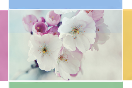
Today I'm going to show you how to add an amazing mouseover effect for Blogger images using only CSS, in which moving your mouse over an image from different directions (from above, from below, etc) will cause an overlay transitioned in from the same vector. This trick will change not only the images appearance when moving mouse over them, but will also allow you to add inside a text with a description.

hover effect, mouseover, blogger hover effects

You can see the effect on this image below: try moving your mouse from the left, right, and above.

hover right hover top hover left hover bottom

Adding Hover Effect From Different Directions on Blogger Images

First thing to do is to add the CSS style to our Template:

Step 1. From Blogger Dashboard, go to Template and press the Edit HTML button


Step 2. Search for the </head> tag - to find it, click anywhere inside the code area, press CTRL + F keys and type it in the search box.


Step 3. After you found it, add the following style just above it: 
<style>
  /* The container and the image */
  div.multi-hover {
    overflow: hidden;
    position: relative;
    vertical-align: middle;
    width: 100%;
    height: 358px;
    line-height: 358px;
  }
  div.multi-hover img {width: 100%;}

/* The texts that, by default, are hidden */
  div.multi-hover span {
    color: #FFF;
    font-size: 32px;
    font-weight: bold;
    height: 100%;
    opacity: 0;
    position: absolute;
    text-align: center;
    transition: all 0.3s linear 0s;
    width: 100%;
  }

/* And this is what will generate the effect */
  div.multi-hover span:nth-child(1) { /* right */
    background: none repeat scroll 0 0 rgba(255, 189, 36, 0.6);
    left: 90%;
    top: 0;
  }
  div.multi-hover span:nth-child(2) { /* top */
    background: none repeat scroll 0 0 rgba(106, 170, 255, 0.6);
    left: 0;
    top: -80%;
  }
  div.multi-hover span:nth-child(3) { /* left */
    background: none repeat scroll 0 0 rgba(204, 87, 166, 0.6);
    left: -90%;
    top: 0;
  }
  div.multi-hover span:nth-child(4) { /* bottom */
    background: none repeat scroll 0 0  rgba(97, 181, 115, 0.6);
    left: 0;
    top: 80%;
  }

  div.multi-hover span:hover {opacity: 1;}
  div.multi-hover span:nth-child(2n+1):hover {left: 0;}
  div.multi-hover span:nth-child(2n):hover {top: 0;}

</style>
Step 4. Save the Template

Now we are going to add the HTML that is nothing but a DIV where we included four SPAN tags with texts and an image:

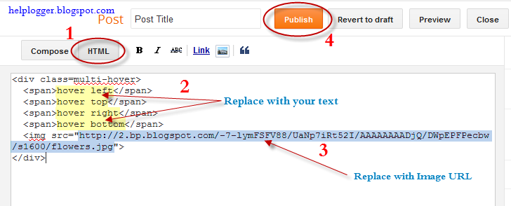
Step 5. Choose Posts, create a New Post, click on the HTML tab (1) and paste this code inside the empty box:
<div class=multi-hover>
  <span>hover right</span>
  <span>hover top</span>
  <span>hover left</span>
  <span>hover bottom</span>
  <img src="https://blogger.googleusercontent.com/img/b/R29vZ2xl/AVvXsEidnOqqzXqXM6hY9-b0k2hYkPzh8TgKVpXljqVHEuwRoTDsrJZvvNcQHEWMV391H0afT7n-x7QOqPzjIy1MyEv0UZRQ34VEGTgd4FqiQOCg3P1WOxEgcC1MWJArDzlIkD8otCpvjyxLqJA/s1600/flowers">
</div>
Add your own text/description to "hover right", "hover top", "hover left" and "hover bottom" (2) and replace the url in blue with the image URL (3) where you want to apply the effect.

Important! Do not click on the Compose tab, otherwise the changes will be lost.


Step 6. After you finished editing your post, click Publish (4)

And that's it... enjoy! :)
Read more > Multi Hover Effect On Blogger Images Using Pure CSS

Sunday, May 26, 2013

How To Add Social Media Icons to Blogger Header

social media icons, facebook icons, social media icons for bloggerThis tutorial will help you to add social media icons in the top right corner of the page which could increases the likelihood that readers can follow through the various social networks. There are several ways to do this, like adding a new widget section to the blog header but now, we'll do it using an unordered list that uses icons of Facebook, Twitter, Google+ and blog feed, and as a bonus, the icons will rotate when you hover over them.

You can see a demo in this test blog.


Adding Social Media Icons to Blogger Header

Step 1. From your Blogger dashboard, go to Template and click on the Edit HTML button:

blogger blogspot, blogger template, blogger gadgets

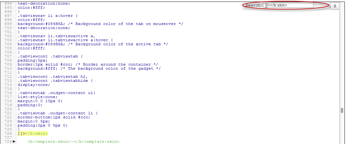
Step 2. To expand the style, click on the small arrow on the left of <b:skin>...</b:skin> (screenshot 1), then click anywhere inside the code area to search (using CTRL + F) for the ]]></b:skin> tag (screenshot 2) and add this code just above it:

 /* Social icons for Blogger
----------------------------------------------- */

#social-icons {
margin-bottom:-30px;
height:50px;
width:100%;
display:block;
clear:both;
z-index: 2;
position: relative;
}
.social-media-icons {
display:table
}
.social-media-icons ul {
text-align:right;
padding:5px 5px 0 0
list-style-image:none;
list-style-position:outside;
list-style-type:none;
}
.social-media-icons ul {
margin-bottom:0;
padding:0;
float:right;
}
.social-media-icons li.media_icon {
margin-left:6px;
padding-left:0 !important;
background:none !important;
display:inline;
float:left;
}
.social-media-icons li:hover {
-moz-transform: rotate(360deg);
-webkit-transform: rotate(360deg);
-o-transform: rotate(360deg);
transform: rotate(-360deg);
-moz-transition: all 0.5s ease-in-out;
-webkit-transition: all 0.5s ease-in-out;
-o-transition: all 0.5s ease-in-out;
-ms-transition: all 0.5s ease-in-out;
transition: all 0.5s ease-in-out;
}

Screenshot 1:


Screenshot 2:


Step 3. Now search for this line

<b:section class='header' id='header' maxwidgets='1' showaddelement='no'>

Step 4. And just above it, add this code:

<div class='social-media-icons' id='social-icons'>
<ul>

<li class='media_icon'><a href='http://facebook.com/username'><img border='0' src='https://blogger.googleusercontent.com/img/b/R29vZ2xl/AVvXsEiylk_BGcur9LF-grxDQq3G6pEkygP7soUNegpu1ajcIyYbjUx1nkzs-vMVe49MBiYPHLz8W_vj2Z_NCB5hZRCEUdEDe9LhmhteqNdzO5_UZKG9fEXyZv17kQu5dlGV0_ruqzLpokSIp38/s1600/Facebook.png'/></a></li>

<li class='media_icon'><a href='http://twitter.com/#!/username'><img border='0' src='https://blogger.googleusercontent.com/img/b/R29vZ2xl/AVvXsEisK2xQGEtWixDc5cp_vuJwqnrMIafMcT_bndNGh4HmWXJ53SnE1FlMaKqK8o_QNQvY_j3IoJb2sKboyP1EzakYxCC0a2zqEiF6qWwqiIYk5unPPFVvzW_IeHMfEJTnyQUW_IIuBxcahuw/s1600/Twitter.png'/></a></li>

<li class='media_icon'><a href='https://plus.google.com/XXXXXXXXXXXXXXXXXX/about'><img border='0' src='https://blogger.googleusercontent.com/img/b/R29vZ2xl/AVvXsEhCSFlB-xa6xTDvpjokJKNMdwJsPZdGCDGfjkUPvmLJOtpg6rNa5IBCeE64-QbUx8nTUlWJIRXYqeq77yPiUKj9Nb_-Hq7US6XvPmB1uOtF080l42k7vUu3n6RNWqElBllxJpwZ6IpfE6U/s1600/googleplus.png'/></a></li>

<li class='media_icon'><a href='http://name-of-your-blog.com/feeds/posts/default'><img border='0' src='https://blogger.googleusercontent.com/img/b/R29vZ2xl/AVvXsEjtqE11AChOWjFZ1x3F2hJ_bbVrnd1cIjwovzvkU4Zj5yD3UHLJRtV7y7ZjecVK-yJ0seIm_Tln6g6YXuOUzzK1E1__KxJ1nwJrXTfCOLa0iOmg15PMWKyzDAQuFYcajt6PlFYEcYIql78/s1600/RSS.png'/></a></li>

</ul></div>

Customization

- Change what's in red with your usernames and id: the first is your Facebook username, the second is that of Twitter, in the third you should change the X by the ID of your Google+ profile and in the fourth you will put the name of your blog.
- To change the icons, just replace the urls in blue with the ones of your images.
- You can add more icons if you want, you just have to add before </ul></div> a line like this for each extra icon you want:

<li class='media_icon'><a href='Link URL'><img border='0' src='Image URL'/></a></li>

Step 5. Finally, Save the Template to apply the changes.

The effect is done with CSS3, so this effect will not work in older browsers.
Read more > How To Add Social Media Icons to Blogger Header

Monday, April 29, 2013

How To Add A Tabbed Navigation Widget to Blogger

The tabviews are elements that allow us to group in a single container various gadgets and these can be selected via tabs.
Its main function is to save space on the blog to avoid scattered gadgets in the same category so you can group multiple gadgets into one. There are several methods for creating tabviews, some require jQuery, other MooTools, or any other script.
To add this widget to your blog, just follow the steps below:

Step 1. From your Blogger Dashboard, go to Template and click on the Edit HTML button

Step 2. Expand the style of the template, by clicking on the sideways arrow before <b:skin> ... </b:skin>


Step 3. Search using CTRL + F for the following tag:

]]></b:skin>


Step 4. Just above it, add the following code:

/* Tabview for Blogger
----------------------------------------------- */
.tabviewcont{
margin:15px 0;
padding:0;
clear:both;
}

.tabviewnav {
margin: 0 0 0 14px;
padding:3px 0; /* If you are using a Blogger Template change 0 with 15px */
font-size:12px; /* Font size of text inside tabs */
font-weight:bold;
}
.tabviewnav li {
list-style:none;
margin:0;
display:inline;
}
.tabviewnav li a {
padding:3px 6px;
margin-right:1px;
background:#F6F6F6; /* The background color of the tabs */
border-radius:5px 5px 0 0;
-moz-border-radius:5px 5px 0 0;
-webkit-border-radius:5px 5px 0 0;
text-decoration:none;
color:#222222;
}
.tabviewnav li a:hover {
color:#222222;
background:#EBEBEB; /* Background color of the tab on mouseover */
text-decoration:none;
}
.tabviewnav li.tabviewactive a,
.tabviewnav li.tabviewactive a:hover {
background:#EBEBEB; /* Background color of the active tab */
color:#222222;
}
.tabviewcont .tabviewtab {
padding:5px;
border:1px solid #EEEEEE; /* Border around the container */
background:#fff; /* The background color of the gadget */
}
.tabviewcont .tabviewtab h2,
.tabviewcont .tabviewtabhide {
display:none;
}
.tabviewtab .widget-content ul{
list-style:none;
margin:0 0 10px 0;
padding:0;
}
.tabviewtab .widget-content li {
border-bottom:1px solid #ccc;
margin:0 5px;
padding:2px 0 5px 0;
}

Step 5. Find the </head> tag and just above it, paste this script:

<script type='text/javascript'>
// Tabview for grouping gadgets

//<![CDATA[
document.write('<style type="text/css">.tabview{display:none;}<\/style>');function tabviewObj(argsObj){var arg;this.div=null;this.classMain="tabview";this.classMainLive="tabviewcont";this.classTab="tabviewtab";this.classTabDefault="tabviewtabdefault";this.classNav="tabviewnav";this.classTabHide="tabviewtabhide";this.classNavActive="tabviewactive";this.titleElements=['h2','h3','h4','h5','h6'];this.titleElementsStripHTML=true;this.removeTitle=true;this.addLinkId=false;this.linkIdFormat='<tabviewid>nav<tabnumberone>';for(arg in argsObj){this[arg]=argsObj[arg]}this.REclassMain=new RegExp('\\b'+this.classMain+'\\b','gi');this.REclassMainLive=new RegExp('\\b'+this.classMainLive+'\\b','gi');this.REclassTab=new RegExp('\\b'+this.classTab+'\\b','gi');this.REclassTabDefault=new RegExp('\\b'+this.classTabDefault+'\\b','gi');this.REclassTabHide=new RegExp('\\b'+this.classTabHide+'\\b','gi');this.tabs=new Array();if(this.div){this.init(this.div);this.div=null}}tabviewObj.prototype.init=function(e){var childNodes,i,i2,t,defaultTab=0,DOM_ul,DOM_li,DOM_a,aId,headingElement;if(!document.getElementsByTagName){return false}if(e.id){this.id=e.id}this.tabs.length=0;childNodes=e.childNodes;for(i=0;i<childNodes.length;i++){if(childNodes[i].className&&childNodes[i].className.match(this.REclassTab)){t=new Object();t.div=childNodes[i];this.tabs[this.tabs.length]=t;if(childNodes[i].className.match(this.REclassTabDefault)){defaultTab=this.tabs.length-1}}}DOM_ul=document.createElement("ul");DOM_ul.className=this.classNav;for(i=0;i<this.tabs.length;i++){t=this.tabs[i];t.headingText=t.div.title;if(this.removeTitle){t.div.title=''}if(!t.headingText){for(i2=0;i2<this.titleElements.length;i2++){headingElement=t.div.getElementsByTagName(this.titleElements[i2])[0];if(headingElement){t.headingText=headingElement.innerHTML;if(this.titleElementsStripHTML){t.headingText.replace(/<br>/gi," ");t.headingText=t.headingText.replace(/<[^>]+>/g,"")}break}}}if(!t.headingText){t.headingText=i+1}DOM_li=document.createElement("li");t.li=DOM_li;DOM_a=document.createElement("a");DOM_a.appendChild(document.createTextNode(t.headingText));DOM_a.href="javascript:void(null);";DOM_a.title=t.headingText;DOM_a.onclick=this.navClick;DOM_a.tabview=this;DOM_a.tabviewIndex=i;if(this.addLinkId&&this.linkIdFormat){aId=this.linkIdFormat;aId=aId.replace(/<tabviewid>/gi,this.id);aId=aId.replace(/<tabnumberzero>/gi,i);aId=aId.replace(/<tabnumberone>/gi,i+1);aId=aId.replace(/<tabtitle>/gi,t.headingText.replace(/[^a-zA-Z0-9\-]/gi,''));DOM_a.id=aId}DOM_li.appendChild(DOM_a);DOM_ul.appendChild(DOM_li)}e.insertBefore(DOM_ul,e.firstChild);e.className=e.className.replace(this.REclassMain,this.classMainLive);this.tabShow(defaultTab);if(typeof this.onLoad=='function'){this.onLoad({tabview:this})}return this};tabviewObj.prototype.navClick=function(event){var rVal,a,self,tabviewIndex,onClickArgs;a=this;if(!a.tabview){return false}self=a.tabview;tabviewIndex=a.tabviewIndex;a.blur();if(typeof self.onClick=='function'){onClickArgs={'tabview':self,'index':tabviewIndex,'event':event};if(!event){onClickArgs.event=window.event}rVal=self.onClick(onClickArgs);if(rVal===false){return false}}self.tabShow(tabviewIndex);return false};tabviewObj.prototype.tabHideAll=function(){var i;for(i=0;i<this.tabs.length;i++){this.tabHide(i)}};tabviewObj.prototype.tabHide=function(tabviewIndex){var div;if(!this.tabs[tabviewIndex]){return false}div=this.tabs[tabviewIndex].div;if(!div.className.match(this.REclassTabHide)){div.className+=' '+this.classTabHide}this.navClearActive(tabviewIndex);return this};tabviewObj.prototype.tabShow=function(tabviewIndex){var div;if(!this.tabs[tabviewIndex]){return false}this.tabHideAll();div=this.tabs[tabviewIndex].div;div.className=div.className.replace(this.REclassTabHide,'');this.navSetActive(tabviewIndex);if(typeof this.onTabDisplay=='function'){this.onTabDisplay({'tabview':this,'index':tabviewIndex})}return this};tabviewObj.prototype.navSetActive=function(tabviewIndex){this.tabs[tabviewIndex].li.className=this.classNavActive;return this};tabviewObj.prototype.navClearActive=function(tabviewIndex){this.tabs[tabviewIndex].li.className='';return this};function tabviewAutomatic(tabviewArgs){var tempObj,divs,i;if(!tabviewArgs){tabviewArgs={}}tempObj=new tabviewObj(tabviewArgs);divs=document.getElementsByTagName("div");for(i=0;i<divs.length;i++){if(divs[i].className&&divs[i].className.match(tempObj.REclassMain)){tabviewArgs.div=divs[i];divs[i].tabview=new tabviewObj(tabviewArgs)}}return this}function tabviewAutomaticOnLoad(tabviewArgs){var oldOnLoad;if(!tabviewArgs){tabviewArgs={}}oldOnLoad=window.onload;if(typeof window.onload!='function'){window.onload=function(){tabviewAutomatic(tabviewArgs)}}else{window.onload=function(){oldOnLoad();tabviewAutomatic(tabviewArgs)}}}if(typeof tabviewOptions=='undefined'){tabviewAutomaticOnLoad()}else{if(!tabviewOptions['manualStartup']){tabviewAutomaticOnLoad(tabviewOptions)}}
//]]>
</script>

Step 6. Finally, look for this line:

<div class='column-right-inner'>

Or if you use an old template of Blogger, search this line:

<div id='sidebar-wrapper'>

Step 7. Paste below one of these two lines, this code:

<div class='tabview'>
<b:section class='tabviewtab' id='Tab1' maxwidgets='1'/>
<b:section class='tabviewtab' id='Tab2' maxwidgets='1'/>
<b:section class='tabviewtab' id='Tab3' maxwidgets='1'/>
</div>

Step 8. Save changes, and go to Layout and there you will see the new areas to add gadgets.


You just have to click on Add a Gadget to add the gadget to the tab that corresponds, or drag a gadget you already have to that section.

If you want to add more tabs, then just add before the last </div> a line like this:

<b:section class='tabviewtab' id='Tab4' maxwidgets='1'/>

Note that each line you add should have a different ID, for example Tab5, Tab6, etc..

You can add multiple tabs, just repeat the last step and likewise remember to change the name of the IDs.

Remember that if your sidebar is too narrow, then you should not put a lot of tabs, or tab titles that are very long.

You should also note that this gadget does not speed up the loading speed of the blog, is only to group gadgets into one, even, depending on the blog-may take a while to load the tabview.
Read more > How To Add A Tabbed Navigation Widget to Blogger

Friday, April 12, 2013

How To Use The New Blogger HTML Editor

The Blogger template editor now includes a number of changes that seem interesting and make it much more friendly than it was.

To begin with, what we see now is all the template's code starting with numbered and colored lines showing us different code snippets: tags, variables, properties, etc.. depending on the HTML, CSS, JavaScript and even the language of Blogger - include, b:if and other occurrences.

blogger template, blogger tricks, blogger widgets

This is what any decent external editor does, but certainly, from now on it will be much easier to find that little bug that drives us crazy when we omit quotation marks or add one more semicolon. This also applies to CSS, which appears mostly in dark blue without distinguishing selectors and rules, but the rest is a major improvement.

Another great help are the numbers that appear in front of each fragment of code, so that we can easily pinpoint and correct errors of this type: "Error parsing XML, line 103, column 9: The element ... "

Using the New Blogger Template HTML Editor

When you want to search for a code in the HTML editor, click inside the editor and press CTRL + F on your keyboard, then enter what you want to find in the search box that appears inside the editor.


Finally, hit the "ENTER" button on your keyboard and it should take you to the requested code.

If you want to be taken to the section of code that belongs to a particular widget, just click on the Jump To Widget button at the top of the editor, choose the widget's name from the list and it will take you directly to that portion of code.


The CSS rules can be found folded at the top of the template, between <b:skin>...</b:skin> and <b:template-skin>...</b:template-skin> tags. To expand them, you have to click on the sideways arrow next to the line number.


Another great functionality is that now we can Preview Template in the same window without needing to leave the page and we can easily go back to customize our template by clicking on the Edit Template button.

Finally, Format template re-orders the code, adding indentation automatically.

As always, we must use the Save button for the changes to take effect or we can Revert the changes.

And that's it. With a bit of effort, we can easily familiarize with this new HTML editor. Surely as usual and even reasonable to be something inherent in the human condition, this change does not appeal to many. Same with the Lightbox for images, the new template designer, the new desktop and other new things that have been added in the past. But who now remembers that they once were new?
----------
For more info, check out this post on the Blogger Buzz blog, where Google software engineers +Samantha Schaffer and +Renee Kwang explained the steps for moving the date of a blog post from above the post title to underneath it, as an example in using the new Blogspot HTML editor.
Read more > How To Use The New Blogger HTML Editor

Sunday, March 31, 2013

Related Posts Widget with Thumbnails and Summary for Blogger

There are several tutorials quite old which have explained different methods for displaying related posts in Blogger [1] [2] but in this tutorial, I will show you how to implement a very beautiful Related Posts widget that comes along with Thumbnails and Posts Snippets, as well. If you want to add it, follow the next steps below:

How to Add Related Posts Widget with Summary to Blogger

Step 1. From your Blogger Dashboard, go to Template and click on Edit HTML


Step 2. Tick the "Expand Widget Templates" checkbox:
 Step 3. Find (CTRL + F) this tag:

</head>

...and paste the following code just above it:

<script type='text/javascript'>
//<![CDATA[
var relatedTitles = new Array();
var relatedUrls = new Array();
var relatedpSummary = new Array();
var relatedThumb = new Array();
var relatedTitlesNum = 0;

var relatedPostsNum = 4; // number of entries to be shown
var relatedmaxnum = 75; // the number of characters of summary
var relatednoimage = "https://blogger.googleusercontent.com/img/b/R29vZ2xl/AVvXsEiu-voVTGTUn6_9mB-6ZKCCm7FZZZ0H_Tk01SY_73YpZ1CMVwyvOQixi1nJFxEiJOyuNQkez8JGi0dTI3DCQb8z8pDBflP1WZFYj32nfuJwKKeNcY2XrHqowIc1rXySdo84__UjCPuvdwDD/s1600/no_image.jpg"; // default picture for entries with no image

function readpostlabels(json) {
  var entry, postimg, postcontent, cat;
  for (var i = 0; i < json.feed.entry.length; i++) {
    entry = json.feed.entry[i];
    if (i==json.feed.entry.length) { break; }
    relatedTitles[relatedTitlesNum] = entry.title.$t;
    postcontent = "";
    if ("content" in entry) {
      postcontent = entry.content.$t;
    } else if ("summary" in entry) {
      postcontent = entry.summary.$t;
    }
    relatedpSummary[relatedTitlesNum] = removetags(postcontent,relatedmaxnum);
    if ("media$thumbnail" in entry) {
      postimg = entry.media$thumbnail.url;
    } else {
      postimg = relatednoimage;
    }
    relatedThumb[relatedTitlesNum] = postimg;
    for (var k = 0; k < entry.link.length; k++) {
      if (entry.link[k].rel == 'alternate') {
        relatedUrls[relatedTitlesNum] = entry.link[k].href;
        break;
      }
    }
    relatedTitlesNum++;
  }
}
function showrelated() {
  var tmp = new Array(0);
  var tmp2 = new Array(0);
  var tmp3 = new Array(0);
  var tmp4 = new Array(0);
  for(var i = 0; i < relatedUrls.length; i++) {
    if(!contains(tmp, relatedUrls[i])) {
      tmp.length += 1; tmp[tmp.length - 1] = relatedUrls[i];
      tmp2.length += 1; tmp2[tmp2.length - 1] = relatedTitles[i];
      tmp3.length += 1; tmp3[tmp3.length - 1] = relatedpSummary[i];
      tmp4.length += 1; tmp4[tmp4.length - 1] = relatedThumb[i];
    }
  }
  relatedTitles = tmp2; relatedUrls = tmp; relatedpSummary = tmp3; relatedThumb = tmp4;
  for(var i = 0; i < relatedTitles.length; i++){
    var index = Math.floor((relatedTitles.length - 1) * Math.random());
    var tempTitle = relatedTitles[i]; var tempUrls = relatedUrls[i];
    var tempResum = relatedpSummary[i]; var tempImage = relatedThumb[i];
    relatedTitles[i] = relatedTitles[index]; relatedUrls[i] = relatedUrls[index];
    relatedpSummary[i] = relatedpSummary[index]; relatedThumb[i] = relatedThumb[index];
    relatedTitles[index] = tempTitle; relatedUrls[index] = tempUrls;
    relatedpSummary[index] = tempResum; relatedThumb[index] = tempImage;
  }
  var somePosts = 0;
  var r = Math.floor((relatedTitles.length - 1) * Math.random());
  var relsump = r;
  var output;
  var dirURL = document.URL;

  while (somePosts < relatedPostsNum) {
    if (relatedUrls[r] != dirURL) {

      output = "<div class='relatedsumposts'>";
      output += "<a href='" + relatedUrls[r] + "' rel='nofollow'  target='_self' title='" + relatedTitles[r] + "'><img src='" + relatedThumb[r] + "' /></a>";
      output += "<h6><a href='" + relatedUrls[r] + "' target='_self'>" + relatedTitles[r] + "</a></h6>";
      output += "<p>" + relatedpSummary[r] + " ... </p>";
      output += "</div>";
      document.write(output);
     
      somePosts++;
      if (somePosts == relatedPostsNum) { break; }
    }
    if (r < relatedTitles.length - 1) {

      r++;
    } else {
     
      r = 0;
    }

    if(r==relsump) { break; }
  }
}
function removetags(text,length){
  var pSummary = text.split("<");
  for(var i=0;i<pSummary.length;i++){
    if(pSummary[i].indexOf(">")!=-1){
      pSummary[i] = pSummary[i].substring(pSummary[i].indexOf(">")+1,pSummary[i].length);
    }
  }
  pSummary = pSummary.join("");
  pSummary = pSummary.substring(0,length-1);
  return pSummary;
}
function contains(a, e) {
  for(var j = 0; j < a.length; j++) if (a[j]==e) return true;
  return false;
}
//]]>
</script>

Note:  
  • To change the number of posts that are being displayed, modify the value in red (4)
  • To change the number of characters to be shown in posts summary, modify the value in green (75)
  • To change the default pic for posts with no images, add your URL instead of the one marked in blue

Step 4. Search (CTRL + F) for the following fragment:

<a expr:href='data:label.url' rel='tag'><data:label.name/></a><b:if cond='data:label.isLast != &quot;true&quot;'>,</b:if>

... and add this code just below it:

<b:if cond='data:blog.pageType == &quot;item&quot;'>
    <script expr:src='&quot;/feeds/posts/default/-/&quot; + data:label.name + &quot;?alt=json-in-script&amp;callback=readpostlabels&amp;max-results=50&quot;' type='text/javascript'/>
  </b:if>

The entire fragment should look like this:

          <b:loop values='data:post.labels' var='label'>
            <a expr:href='data:label.url' rel='tag'><data:label.name/></a><b:if cond='data:label.isLast != &quot;true&quot;'>,</b:if>
<b:if cond='data:blog.pageType == &quot;item&quot;'>
    <script expr:src='&quot;/feeds/posts/default/-/&quot; + data:label.name + &quot;?alt=json-in-script&amp;callback=readpostlabels&amp;max-results=50&quot;' type='text/javascript'/>
  </b:if>

          </b:loop>

Step 5. Find this fragment of code:

</b:includable>
<b:includable id='postQuickEdit' var='post'>

Note: if you can't find it, then search only for the code in red

! Click on the sideways arrow to expand the code, then scroll down until you reach to the highlighted line !

...add just ABOVE it, add the following:

<b:if cond='data:blog.pageType == &quot;item&quot;'>
  <div class='post-footer-line post-footer-line-4'>
    <div id='relatedpostssum'><div style='text-align: left; font-size: 15px; margin-bottom: 10px; font-weight: bold;'>RELATED POSTS</div>
      <script type='text/javascript'>showrelated();</script>
    </div>
    <div style='clear:both;'/>
  </div>
</b:if>

Screenshot

Step 6. Let's go ahead and add some styles to our CSS... search for this tag:

]]></b:skin>

...and paste the below code just ABOVE it:

.relatedsumposts {
  float: left;
  margin: 0px 5px;
  overflow: hidden;
  text-align: center;
  /* width and height of the related posts area */
  width: 120px;
  height: 210px;
}

.relatedsumposts:hover {
background-color: #F3F3F3; -webkit-border-radius: 10px;
-moz-border-radius: 10px;
border-radius: 10px;
}

.relatedsumposts img:hover {
-khtml-opacity:0.4;
-moz-opacity:0.4;
opacity:0.4;
}

.relatedsumposts a {
  /* link properties */
color: #linkcolor;
  display: inline;
  font-size: 10px;
  line-height: 1;
}
.relatedsumposts img {
  /* thumbnail properties */
margin-top: 2px;
  height: 82px;
  padding: 5px;
  width: 82px;
border: 1px solid #fff;
-webkit-border-radius: 100px;
-moz-border-radius: 100px;
border-radius: 100px;
-webkit-box-shadow: 0 1px 2px rgba(0, 0, 0, .4);
-moz-box-shadow: 0 1px 2px rgba(0, 0, 0, .4);
box-shadow: 0 1px 2px rgba(0, 0, 0, .4);
}
.relatedsumposts h6 {
  /* title properties */
  display: table-cell;
  height: 5em;
  margin: 5px 0 0;
  overflow: hidden;
  padding-bottom: 2px;
  vertical-align: middle;
  width: 130px;
}

.relatedsumposts p {
  /* summary properties */
border-top: 1px dotted #777777;
border-bottom: 1px dotted #777777;
color: #summarycolor;
  font-size: 10px;
  height: 4em;
  line-height: 1;
  margin: 5px 0 0;
  overflow: hidden;
  padding: 5px 0 15px 0;
  text-align: left;
}

Note:  
  • Modify the values in red to adjust the width (120) and height (210) of the widget area
  • Replace #linkcolor with the hex value of your color to change the color of post titles
  • To change the size of thumbnails, modify the values marked in violet (82)
  • To determine the border roundness, modify the values in orange (100)
  • To change the color of the post snippet, change #summarycolor with color hex value

Step 7. Save your Template... and hopefully we're done...

Enjoy!
Read more > Related Posts Widget with Thumbnails and Summary for Blogger

Tuesday, March 19, 2013

CSS Basics. How to Apply Rounded Corners On Images #2

blogger tricks, css tricks, border radiusIn the previous post I have mentioned that we will learn to round images using CSS, without needing to edit them one by one using a program. Now that we have seen the basics of CSS, let's try to apply to some images.

What we will do is to upload an image as normal (HTML) and then add some rules in our style sheet that will transform the outer shape as a circle... or at least to appear round. This will depend on the proportions of image that we use.

In fact, we can apply this effect to any image, to all of an area or to all in our blog. That depends on your tastes.

Marking up HTML

Obviously the first thing we need for in order to round an image is an idem. The code could be more complicated, but an image is built within the img tag and basically looks like this:

<img src="image_URL"/>

Screenshot:


This is how we make it look something like the one from the left. Normally, it should also keep an alt text and sometimes it carries some forced dimensions (with width and/or height). When you upload an image, the code inside the Blogger editor also contains a link that is pointing to the original image.

But if we want to modify this image using CSS, we need to incorporate a class selector. We can add it in two ways: within the img tag or to a parent box. The name that I have chosen for the selector is roundedcorners:

<img class="roundedcorners" src="image_URL"/>


<div class="roundedcorners">
<img src="image_URL"/>
</div>


Applying style to all homogeneous elements

But that selector alone will do nothing. It needs to be linked to a style rule that tells what to do with it. As much as we add classes, if these are not defined in the CSS, the appearance of the image (or a certain element) will not change.

To change the shape of all the images on our blog, this would be what we should add to our CSS:

img {
border: 2px solid #BADA55;
margin: 0;
padding: 0;
border-radius: 900px;
-moz-border-radius: 900px;
}

And how it translates to your browser? As follows:

Search for images by name tag (img) and apply the following style:
  • a solid green border of 2 pixels
  • margins (space outside the border) and padding (space inside the border) is set to zero
  • the image is round at the four corners

Now that we have this rule in our style sheet itself, we can see the picture as we wanted - see the example on the right.

To declare a property correctly, we need to know what it does and how to write and you can find more info in many places, although W3C is the authority in this.

For example border-radius requires initially 4 values reading from left to right that represent the roundness of the upper-left, upper-right, lower-right and lower-left corner. If you put a single value is understood that all four will be equal to that.

You should also know that when the value of the border exceeds the dimensions of the box, this border is adapted to form a circle.

How to Apply Style to the Elements of the Same Block

But surely we do not want all the blog images to be round, but only those that we choose, otherwise adding the above style in the head tag will make all of our blog images to take this shape. Before we used an HTML tag (img) and not a selector and that is why the style will affect all images.

To avoid this, we can do one of the things we saw at the beginning and that was to put the image inside a div with the roundedcorners class. In this way, only the images that are in a box with that class will be affected by the rule that will make them round.

<div class="roundedcorners"><img src="image_URL"/></div>

But the rule then should not attack the img tag directly, but the roundedcorners selector. In this case, you should write it like this:

.roundedcorners img {
border: 2px solid #BADA55;
....
}

This means that this style applies only to images that are in a box with roundedcorners class.

Epilogue

To close the subtopic of rounding images, you have to keep in mind that if these are not square, instead of becoming circular, they will look oval.


To fix this we should add the width and height with the same measure (value in pixels), that is to force the image cropping and to make it appear perfectly circular. That was all!

If you enjoy reading this blog, please share and subscribe. For any questions, drop a comment below ;)

Read more > CSS Basics. How to Apply Rounded Corners On Images #2

Monday, March 18, 2013

CSS Basics. How to Apply Rounded Corners On Images #1

This tutorial will explain how to change the outside border of any image using some simple CSS rules to make it round, but this is so easy to do, that I'm finally going to make this entry for other purposes.
rounded corners, css tricks, blogger tricks, blogger design
The trick today that I'm going to publish in two parts is to help to understand at least a little of what CSS (Cascading Style Sheets) is. But very briefly that I'm not able to do a good comprehensive manual on the subject. For those who want to see a bit more, take a look at this link and for those who really want to learn thoroughly, I recommend to visit this site.

Introduction and terminology

Style sheets aim to help sort out what is the structure of a website and which is its format, its appearance. Thus, the CSS box model is essentially a box that wraps around HTML elements, and it dictates how those boxes are presented in terms of colors, fonts, width, backgrounds etc.

The advantage is that if in the future we decide to change something, we don't have to change all the pages one by one, but simply change the properties of one kind or another box from the style sheet and these changes will automatically apply in all the pages.

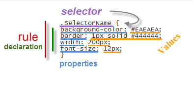
The style sheet is a set of rules, in turn composed of selectors and declarations. The selector is to be used as a nickname or name of what you want to configure from the sheet and apply to the HTML and declarations are properties that are assigned to the desired values ​​(more information on CSS syntax)

Adding the CSS selector

Once we put for example the one above in our style sheet, we see that in our website... nothing happens. I said that the selector is what relates HTML and CSS so that if we want a box to take these values ​​for width, background color, border and font size (that's what we defined earlier), we need to include the selector, thus:

<div class="SelectorName">Text here</div>

What we have added is a rule that tells the browser to interpret that this box has to be of a certain type or class. A class that was mentioned earlier is called selector having some specific properties and values ​​defined in the style sheet.

Now we'll see how this will change the look of the box, while all others that don't have the SelectorName  name will follow the standard appearance.

Therefore, when we include a rule in a style sheet, or modify an existing one, what happens is that all boxes marked with that selector will change their appearance according to the properties-values ​​that we have defined.

On the contrary, if we want that an unmarked box to change its appearance with the CSS rules defined, we'll add the appropriate selector.

Where to add the CSS style

The style can be put in a CSS file. The file is created with all the rules, you get the address and then include the following line in the header of your template. For Blogger, you can add it between <head> and <b:skin><![CDATA[/*:

<link href="syle.css" rel="stylesheet" type="text/css"/>

Note: in blue is where the address of your CSS file should be added.

You can also add the style directly mixed with HTML, inserted between the style tags:

<style>
.SelectorName {
background-color: #EAEAEA;
border: 1px solid #444444;
width: 200px;
font-size: 12px;
}
</style>

It can be inserted into a particular box, as well. In this case, you do not need to add any selector to indicate where the CSS style is:

<div style="background-color: #EAEAEA; border: 1px solid #444444; width: 200px; font-size: 12px;">Text here</div>

In Blogger the rules are between the skin tags, which means they are between <b:skin><![CDATA[/* and ]]></b:skin>. If you edit the template, will find that there are many things in between. All this is CSS that marks the appearance of your blog.

In case we want to see the effect after changing the value of some propriety, we can click on the Preview button. We can also remove anytime a declaration or add another to the desired selector.

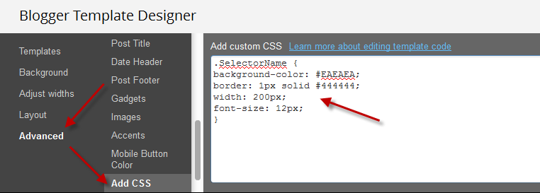
For those who don't want to touch the template, you can add the CSS directly by going to the Advanced section > Add CSS of your Template Designer.


That's enough for today. The next tutorial will discuss in more detail about how to add rounded corners to our images using CSS.
Read more > CSS Basics. How to Apply Rounded Corners On Images #1

Tuesday, March 12, 2013

Add a Different Background For Author Comments in Blogger's Threaded Comments

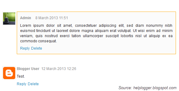
In this tutorial we will learn how to highlight the author comments so that they will have a different background color, border, or anything that makes them stand out from the others. To achieve this, we need to add a code in the Blogger's template and to modify the style according to our preferences.
blogger tricks, blogger comments
  

How to highlight author comments in Blogger:

Step 1. Go to Template, click on Edit HTML

blogger threaded comments, customize blogger comments

Step 2. Click anywhere inside the code area and try to find - using CTRL + F keys - this tag:
</body>
Screenshot:
blogger comments, blogger tricks

Step 3. Just above it, paste the following code:
<script src='http://code.jquery.com/jquery-latest.js'/>
<script>
$(function() {
function highlight(){
$('.user.blog-author').closest('.comment-block')
.css('border', '1px solid #FFA500')
.css('background','#F1F1F2 url("http://www.blogblog.com/1kt/transparent/white80.png")')
.css('color', '#444444')
.css('font-size', '12px')
.css('padding', '10px');
}
$(document).bind('ready scroll click', highlight);
});
</script>

Customizing the Author Comments:


Border:
The line marked in orange represents the border's style.
What it can be done:
  • 1px - you can increase the value to change the border's thickness
  • solid - change the border's style to dotted, dashed, inset, outset etc.
  • #FFA500 - this is the border's color value, change it with your own color

Background:
The line marked in blue represents the background's style. You can use a plain color or an image. By default there's a combination of both (a white transparent image with a gray plain color).
To change/add:
  • a different color: replace the #F1F1F2 value with your own (use this tool to find the hex code of your desired color)
  • an image: replace the defaul url http://www.blogblog.com/1kt/transparent/white80.png with that of your image

Font Color:
To change the font's color, replace the #444444 color value in green with your own. (you can use this tool to find the hex code of your desired color)

Font Size:
Modify the value in red by increasing/decreasing the "12" value in order to change the size of text.

Step 4. Now Save your Template.

To customize the entire style of threaded comments, please check my previous tutorial on How to Customize Comment's Background, Font Color and Border in Blogger.
Read more > Add a Different Background For Author Comments in Blogger's Threaded Comments

Friday, March 8, 2013

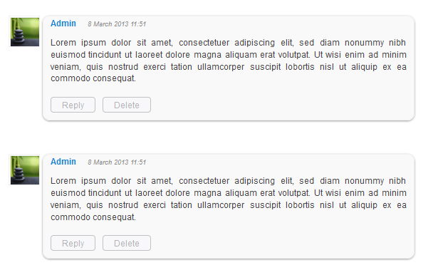
How to Customize Blogger Comments By Adding a Background Color and Border

The comments are an essential part of a blog because in them is reflected the readers' opinions regarding a post or our blog, so it is important to spend a little of our time to make this part looking more presentable, accessible and neat.

To set in order our comments, it is necessary to make each comment easy to identify, therefore to know from where it begins and to where it ends, otherwise it becomes a jumble of letters of which the reader can run away. Here are some ways to make some order by separating each comment.

- Add a Separator To Blogger Comments
- Add a Divider Below Comments in Blogger
- Fully Customize Your Blogger Comments By Changing The Background Color and Border

The first method is the easiest, and is about how to put a border below our comments, this is to separate each blog comment in a simple but effective way.

How to Add a Separator/Border To Blogger Comments

customize comments, blogger

Step 1. To add a simple separator go to Template > Edit HTML and click on the small arrow on the left of <b:skin>...</b:skin>
Step 2. Click anywhere inside the code area and search using CTRL + F keys, for the following piece of code:
]]></b:skin>

Step 3. Paste the following style just above it:

- If we are using threaded comments (with the reply option):

.comment-block {
border-bottom: 1px solid #000000;
}

.comments .continue {
  border-top: 0px solid $(widget.alternate.text.color);
}

- If we are using previous commenting system (with no reply option)

#comments-block .comment-footer {
border-bottom:1px solid #000000;
}

Note: To change the border's color, replace the bolded color value and to change its thickness, increase/decrease the 1 value.

Step 4. Save the Template.

Instead of a simple border, we can also add a divider/image between our comments.

How to Add a Divider (Image) Between Each Comment in Blogger

blogger comments, blogger tricks, blogger tutorials

Step 1. Go to Template > Edit HTML and search (CTRL + F) for the following piece of code:
]]></b:skin>
Screenshot:


Step 2. Paste the following just above it:

- If we are using threaded comments (with the reply option):
.comment-block {
background-image:url(https://blogger.googleusercontent.com/img/b/R29vZ2xl/AVvXsEintcBYp9Kjdi2EgybcEfuGaR1M2UF2SUJToW5nwR-qcfpsszmWCbB3FgeWDEBBi-pDd9RdhQqqCSq1Qnr3C4r2Jhs2aJloCZl4UOZDisDxfl6LEpLl7yuDHm0jm_BZxdfzYnfGcbRkJJGC/s1600/74.gif);
background-repeat:no-repeat;
background-position:center bottom;
padding-bottom:30px;
margin-top: -10px;
}

.comments .continue {
border-top: 0px solid $(widget.alternate.text.color);
}

- If we are using previous commenting system (with no reply function)
#comments-block .comment-footer {
background-image:url(https://blogger.googleusercontent.com/img/b/R29vZ2xl/AVvXsEintcBYp9Kjdi2EgybcEfuGaR1M2UF2SUJToW5nwR-qcfpsszmWCbB3FgeWDEBBi-pDd9RdhQqqCSq1Qnr3C4r2Jhs2aJloCZl4UOZDisDxfl6LEpLl7yuDHm0jm_BZxdfzYnfGcbRkJJGC/s1600/74.gif);
background-repeat:no-repeat;
background-position:center bottom;
height: 50px;
}

Note: The URL that is in blue represents the image that you can change as you like, just remember that at the height must set the height of an image with 30px more, for instance, if the image's height is 50px then the value will be 80px. This is for making sure that the image won't overlap the date of comments. (for threaded comments, increase/decrease the padding 30 value)

Step 3. Save the Template.

But you can still have more styles for each comment, for example adding a background color and a border.

How to Add A Border and A Background Color To Blogger Comments

blogger tips, blogger tricks, gadgets
Step 1. Go to Template > Edit HTML and search for the following piece of code:
]]></b:skin>

Step 2. Paste the following just above it:

- If we are using threaded comments (with the reply option):
.comment-block {
background:#F9F9F9; /* Background Color */
border: 1px solid #f1f1f1; /* Border style */
margin-bottom:20px;
-webkit-box-shadow: 0 1px 2px rgba(0, 0, 0, .4);
-moz-box-shadow: 0 1px 2px rgba(0, 0, 0, .4);
box-shadow: 0 1px 2px rgba(0, 0, 0, .4);
-moz-border-radius: 10px;
-webkit-border-radius: 10px;
border-radius: 10px;
}

.comments .comment-thread.inline-thread {
background-color: #FAFAFA; /* Background color behind the replies */
border-left: 4px dotted #E6E6E6; /* Border on the left side of replies */
}

.comment-content {
padding:2px 10px 10px 10px;
color:#444444; /* Font Color in Comments */
}

.datetime a {
font-style:italic;
font-size:9px;
margin-left: 2px;
}

.comments .comments-content .user a{
color:#1982D1; /* Author's name color */
font-size: 12px; /* Author's name size */
padding-left: 10px;
font-weight:bold;
text-decoration:none;
}

.comments .comment .comment-actions a,.comments .comment .continue a{
display:inline-block;
margin:0 0 10px 10px;
padding:0 15px;
color:#B4B4B7;
text-align:center;
text-decoration:none;
background:#F8F8FB;
border:1px solid #C2C2C5;
border-radius:4px;
height:20px;
line-height:20px;
font-weight:normal;
cursor:pointer;
}

.comments .continue {
border-top: 0px solid $(widget.alternate.text.color);
}

.comments .comments-content .icon.blog-author {
background-image: none;
margin-left: -10px;
}

.comments .avatar-image-container{
margin: 0px 0px 0px 0px;
padding: 0px 0px 0px 0px;
width: 40px;
max-height: 40px;
border: 1px solid #F2F2F2;
padding: 1px;
}

.comments .avatar-image-container img{
margin: 0px 0px 0px 0px;
padding: 0px 0px 0px 0px;
max-width: 40px;
height: 40px;
}

Step 3. Save the Template.

- If we are using previous commenting system (with no reply function):

Step 1. Search for this line in your template:
<b:loop values='data:post.comments' var='comment'>

Step 2. Then, add the following code just below of it:
<div class='comments-ct'>

Step 3. Look a little further down and you'll see the </b:loop> code and just above it, add this:
</div>

Step 4. Now find this:
]]></b:skin>

Step 5. And just above of it, add this CSS code:
.comments-ct{
background:#F9F9F9; /* Background Color */
border: 1px solid #f1f1f1; /* Bprder Style */
margin-bottom:20px;
-webkit-box-shadow: 0 1px 2px rgba(0, 0, 0, .4);
-moz-box-shadow: 0 1px 2px rgba(0, 0, 0, .4);
box-shadow: 0 1px 2px rgba(0, 0, 0, .4);
-moz-border-radius: 10px;
-webkit-border-radius: 10px;
border-radius: 10px;
}

.comment-body {
color:#444444; /* Font Color in Comments */
padding:10px;
}

.comments-ct a {
padding-left: 5px; /* Link color */
color: #4A9BD8;
}

.comment-timestamp a {
font-style:italic;
font-size:9px;
padding-right:10px;
padding-left:10px;
}
(The rounded edges will not work in Internet Explorer with CSS)

In either case, you can change the background color, border, etc.. in parts with annotations in green.

Step 6. Save the Template.

If you need more help, leave a comment below.
Read more > How to Customize Blogger Comments By Adding a Background Color and Border
 
 
Copyright © blog
Blogger Theme by Blogger Designed and Optimized by Tipseo